

Stand OA Nail 16m² - Trade show Cosmoprof
OA Nail is aimed at beauty professionals specialising in nail application: beauticians and technicians who know the products, compare finishes and judge a brand as much on the image it projects as on the quality of its range. At Beauty Profs, the brand was tasked with creating a gentle respite within a very bustling hall. With just 16sqm to work with, the aim was to create a cosy, homely atmosphere that makes people want to stop and linger. Translated with DeepL.com (free version)
AUKARÉ
expertise
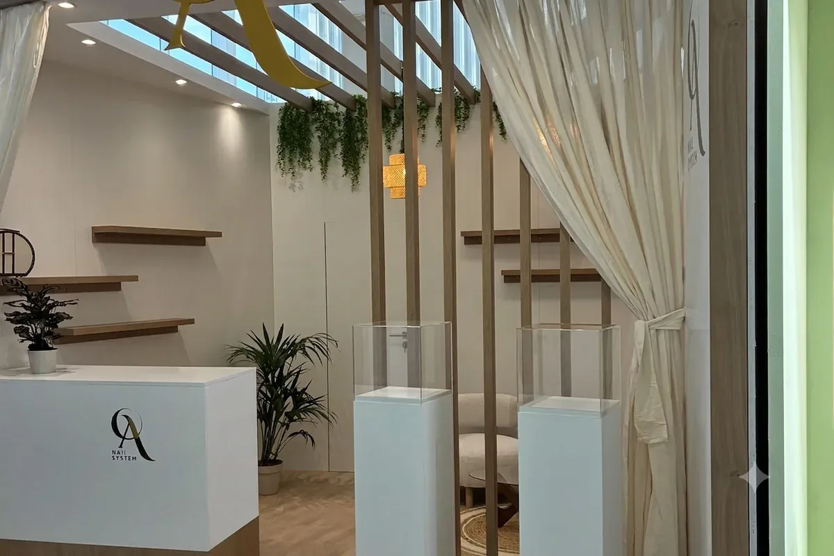
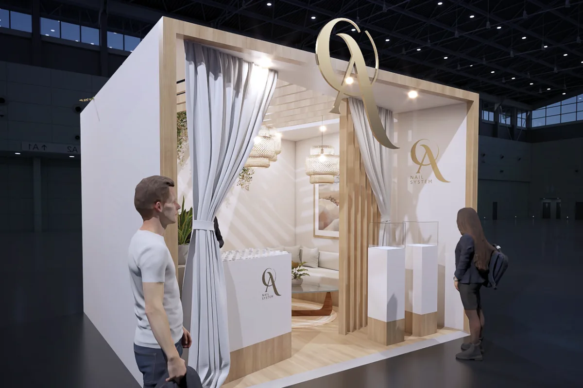
The challenge set for AUKARÉ: to create an interior, not a stand. Within a 16sqm space, everything must give the impression of being in a thoughtfully designed living space rather than a makeshift commercial area. This involves choosing furniture, plants, materials and lighting that break away from the usual conventions of beauty trade fairs. The storage area had to be integrated discreetly; the logo had to be three-dimensional rather than a sticker; and the separation between the relaxation area and the product area had to be achieved using a trellis rather than a solid partition. This commitment to quality across 16m² serves as a reminder that floor space does not determine the standard of finish: a bespoke stand can be just as well-executed at 16m² as it is at 100sqm.

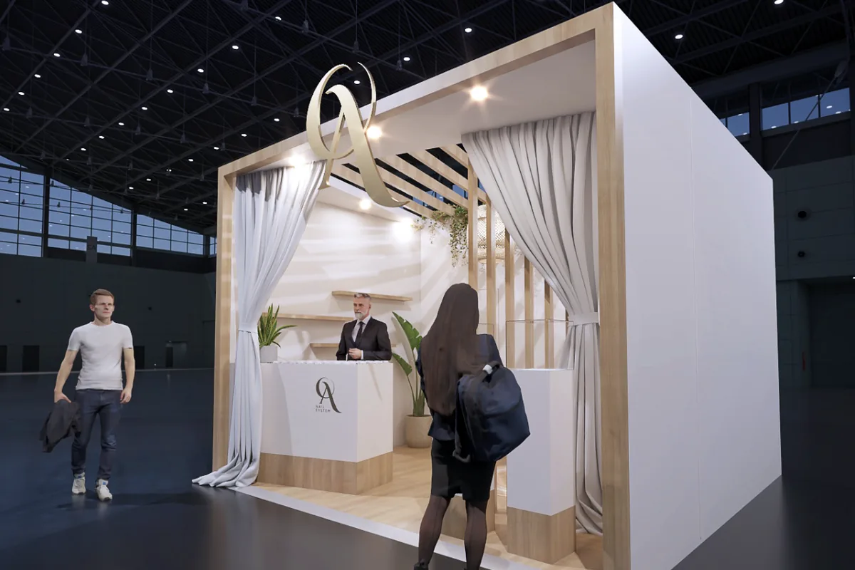
What the team has created
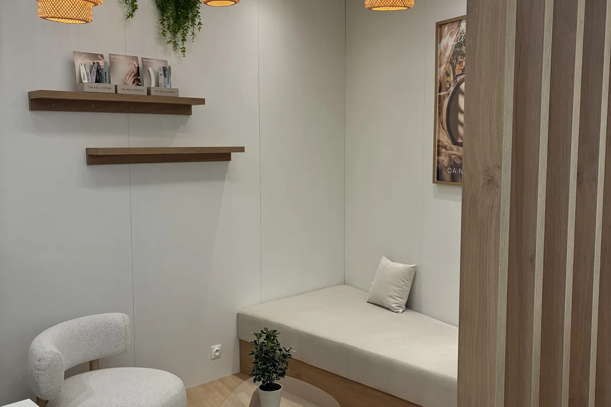
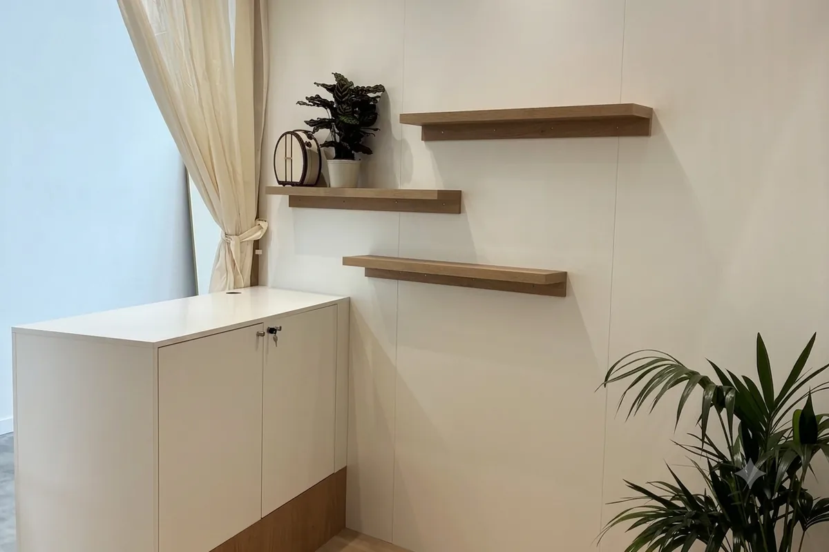
AUKARÉ designed a stand featuring two distinct zones separated by a melamine screen: at the front, a product display area with two melamine plinths topped by Plexiglass domes to showcase flagship products, alongside shelves for displaying the wider range. Further back lies a cozy area featuring custom bench seating, a coffee table selected by the AUKARÉ team, bamboo pendant lights, and trailing ivy. Draped curtains at the entrance act as a symbolic threshold, creating the feeling of stepping into a home interior rather than a trade show stand. The OA Nail logo, crafted from painted MDF in the workshop, is mounted in 3D relief on the back wall. A technical PVC floor anchors the entire layout. Finishing touches, such as artwork and objects provided by the client, complete the overall look and feel.
2
16
m²
1
1
Architecture & Materials:
Melamine forms the core structure of the stand, including the screen partition, display pillars, reception desk with built-in storage, and shelving. Its matte, neutral finish serves as a backdrop for the greenery and furniture, without competing with the products on display. The bench seating is custom-made to fit the exact dimensions of the "cocooning" area. Plexiglass domes placed atop the pillars transform flagship products into objects to be admired rather than merely items to be purchased.
Colors & Identity:
The stand plays with neutral, natural, and botanical tones: wood, white, and the green of the foliage. There are no large blocks of imposed corporate color. The OA Nail identity is conveyed through the dimensional logo and the products themselves, rather than printed panels. This choice of chromatic restraint aligns with a discreet, high-end positioning.
Technical Features:
A raised PVC floor allows for discreet lighting wiring. Bamboo pendant lights and trailing ivy serve as the primary atmospheric elements, creating a sense of warmth within a small footprint without taking up valuable floor space. Draped fabric at the entrance acts as a soft divider from the aisle, creating a welcoming transition rather than a deterrent barrier. Visitor Experience & Flow: The visitor journey is designed in three stages: 1. Distant Appeal: The draped fabric, greenery, and dimensional logo create a home-like visual signature that stands out against the printed-panel stands typical of the beauty hall. 2. Invitation to Enter: The open frontage—with product pillars visible from the aisle—invites visitors to approach. The draped fabric marks a threshold to be crossed, not a barrier. 3. Engagement and conversion: once inside, the cozy banquette and inviting furnishings slow the visitor down and create the right atmosphere for a lengthy conversation about the product range, far removed from the rush of the lobby.






@2026 AUKARÉ all rights reserved.