

Subtil 42m² Booth - MCB Paris Trade Show
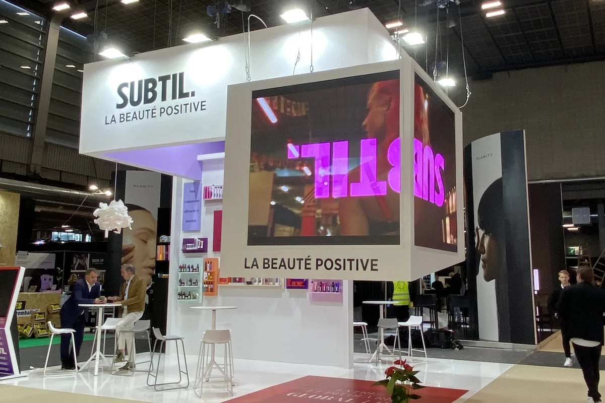
Subtil is a French-based manufacturer of professional hair color products. At MCB, the leading professional hair trade show in Paris, the brand wanted to introduce a new product line centered on red, with a clear goal: to spark curiosity rather than just display products. In a trade show where every hair color booth relies on bold color palettes, Subtil needed a stand that would create an event rather than just serve as a showcase.
AUKARÉ
expertise
The challenge entrusted to AUKARÉ: organize several product lines within 42m², creating a clear hierarchy between what is shown immediately and what is revealed. The challenge was not just logistical; it was editorial. The new product line was not to be displayed on the facade like the rest: it deserved its own space—enclosed, visible from the outside, but accessible only from within. A secret room to build desire before satisfying it. At the same time, the stand had to serve as a data collection tool through a game, and provide a photocall area to generate Instagram content during the show.
This logic of a scripted journey with zones of increasing intensity is part of an approach custom stand : only a stand designed from scratch allows for precise control over the hierarchy of information.
What the team has created
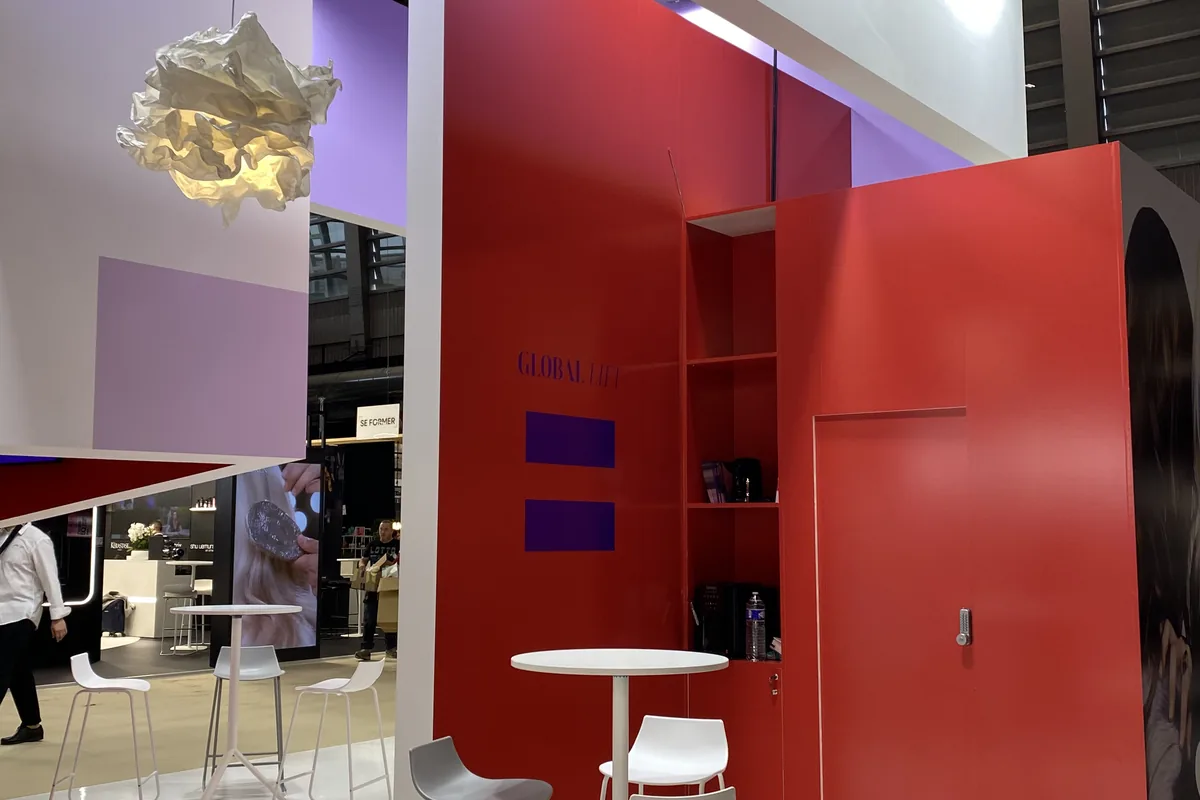
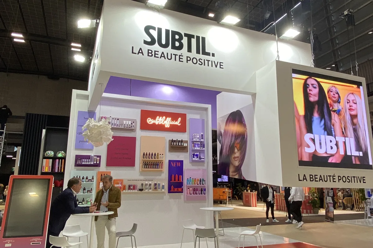
AUKARÉ designed an open, walk-through island stand, organized into four distinct zones with a logical flow. The enclosed red space in the center, lined with a red interior velum and equipped with two 2x2m LED screens, hosts the presentation of the new product line: visitors enter a melamine cube where the walls explain the product and a TV plays brand content. The coffee area with a niche at the back of the stand serves as a friendly decompression point. The photocall area allows for Instagram activities and client content creation. The sales area features product shelves for displaying the range and a gaming terminal for visitor data collection. Three high tables encourage visitors to stand and remain dynamic in front of the products. The high-mounted sign made of painted MDF is interlocking and cut-out, purple on the inside and white on the outside, with an adhesive logo.
4
1
1
3
Architecture & materials
The stand is built on a melamine frame, chosen for its lightness and its ability to be painted and cut with precision. The presentation cube for the new product is the most elaborate piece: painted MDF, red interior velum, and two integrated 2x2m LED screens. The closed shape of the cube is intentional; it breaks the open-island concept that the rest of the stand adopts and physically embodies the idea of a secret.
Colors & identity
Red is the pivot color of the stand, carried by the cube and the new product line. The high-mounted sign introduces the brand's signature purple as an interior color, reserved for those who get closer. The white exterior remains neutral and legible from the aisle. This interior/exterior play on the same sign is a metaphor for the stand's approach: what matters is earned by moving forward.
Technical features
The two 2x2m LED screens integrated into the red cube broadcast explanatory content in an immersive format, within a space completely closed off from the outside. The gaming terminal in the sales area serves as both a booth activity and a data collection mechanism: the visitor plays, leaves their contact details, and the sales team collects qualified leads.
Visitor experience & journey
The journey was designed in three stages:
1. Long-distance attraction: the high-mounted wooden sign with interlocking shapes, with the purple visible through transparency, signals Subtil in a hall where flat printed signs dominate.
2. Invitation to enter: the walk-through, open stand does not block traffic; it invites people to pass through. The red cube, visible from the aisle, triggers curiosity even before entering.
3. Engagement and conversion: visitors entering the red cube discover the new product in a curated display space. Sales conversations naturally transition to the product shelves, before the gaming kiosk wraps things up with lead capture.






@2026 AUKARÉ all rights reserved.