
Rodolphe&co 36sqm stand - MCB Trade Show
Rodolphe & Co is not just a brand. It is a group of independent hair care brands, each with its own community, aesthetic, and positioning: Rainbow for bold, rainbow-colored dyes; CœurL for specialized natural curl care; and Rodolphe & Co for organic cosmetics made in France. At MCB, the professional hair show where every exhibitor fights for attention in a hall saturated with creativity, the brand needed to simultaneously showcase its three distinct worlds, assert a signature identity for the Rodolphe & Co house, and generate maximum foot traffic within a 36sqm space.

AUKARÉ
expertise
The challenge given to AUKARÉ was radical: to design not just a booth, but a place—a destination where hairdressers would want to enter not because they are looking for a product, but because the space itself draws them in irresistibly. In a show where everyone is exhibiting, Rodolphe & Co had to be the one everyone talks about.
This project is a direct illustration of the major booth design trends for 2026 : the booth as a content studio, targeted immersive experiences, and scenography designed for virality.

What the team has created
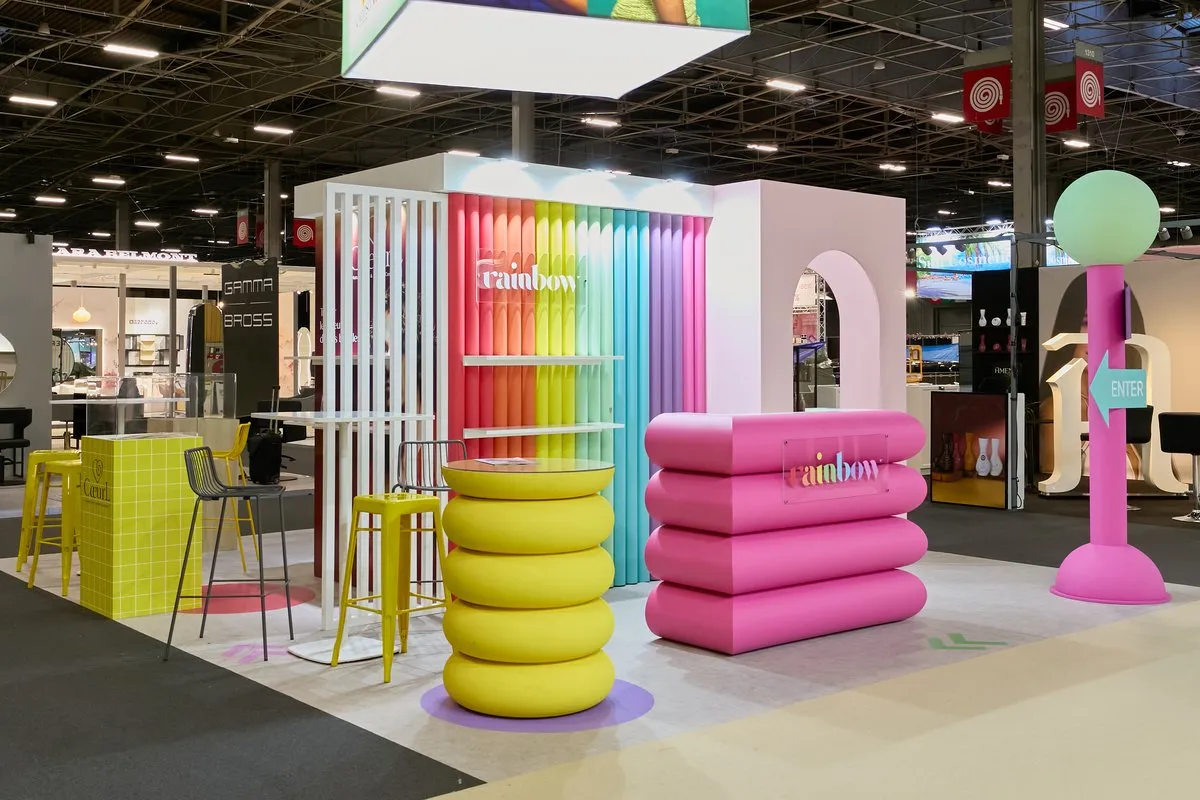
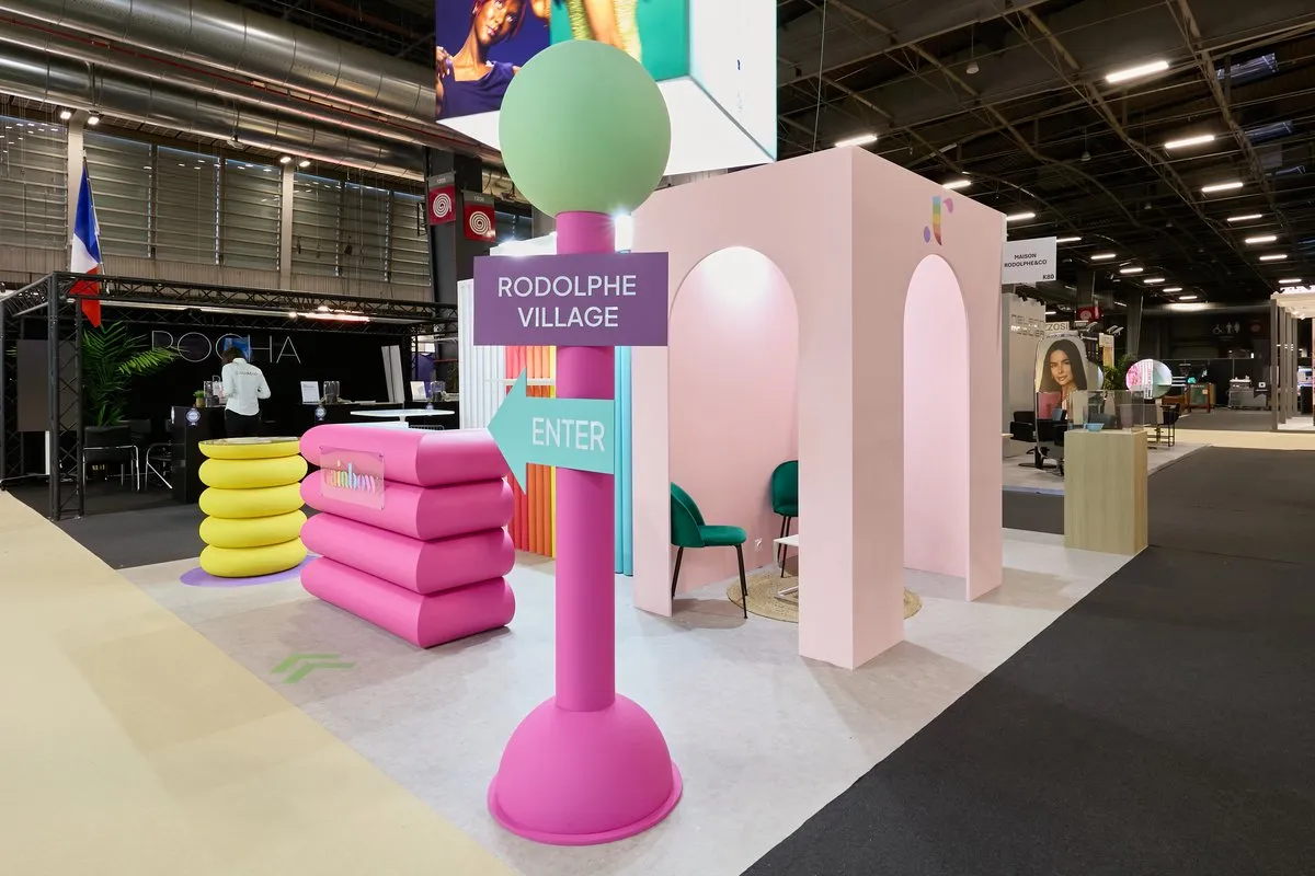
AUKARÉ opted for a total scenographic approach: transforming the 36sqm into a miniature village—"Rodolphe Village"—complete with its own directional signage, urban codes, and aesthetic rules. A fuchsia pink signpost with a mint-colored ball, indicating "Rodolphe Village / Enter" in road-sign lettering, physically embodies this concept at the booth entrance. It is not a booth. It is a destination.
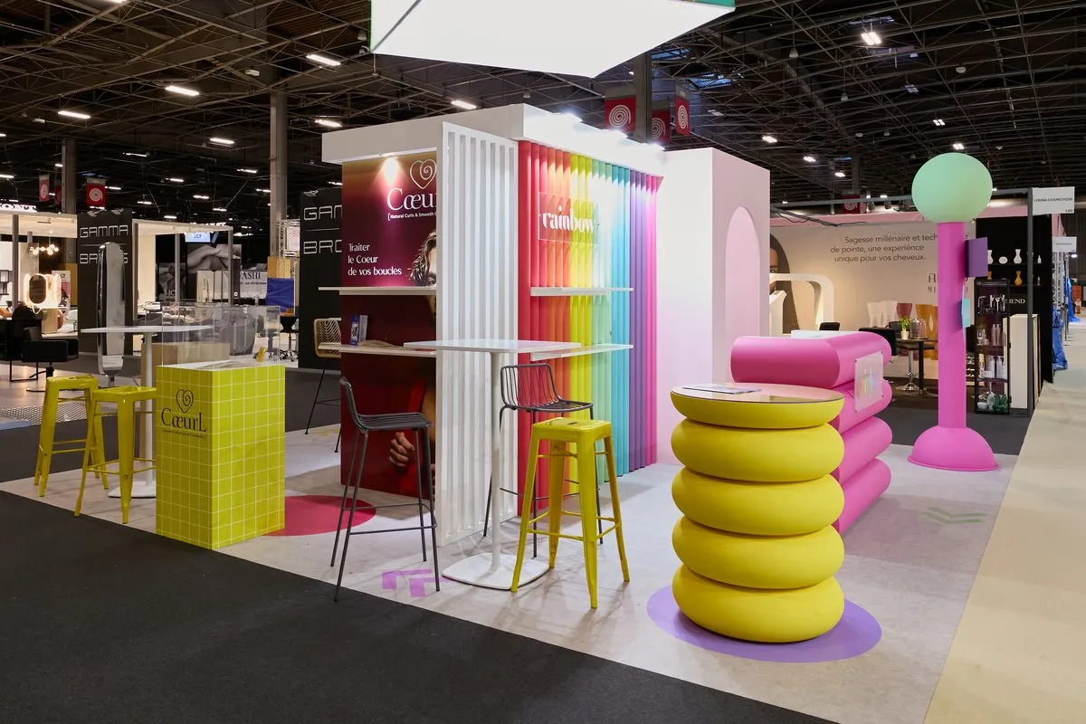
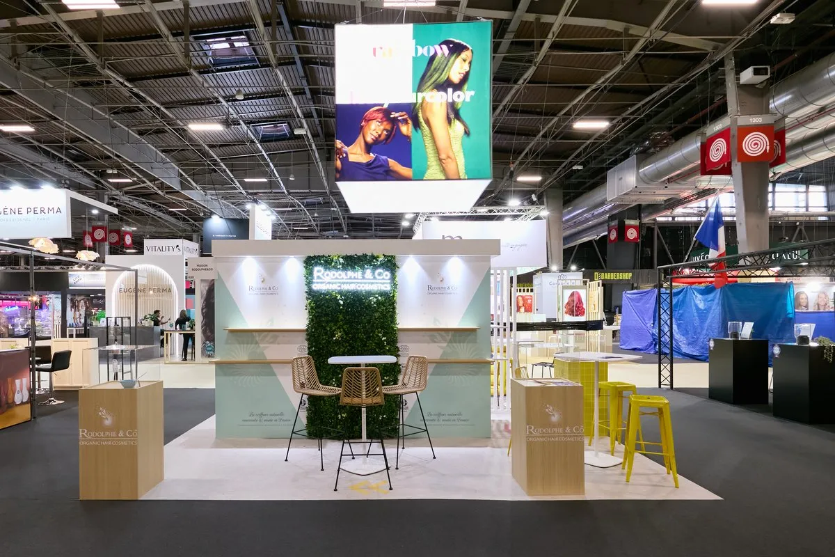
Each brand occupies its own territory within this village: Rainbow expresses itself through a wall of tubes in a full rainbow gradient and a custom fuchsia bubble-module counter; CœurL inhabits a plum-red zone with a sensory backdrop and lemon-yellow furniture; Rodolphe & Co Organic sets up a nature-inspired space with a green wall, rattan furniture, and a sage-green background. A backlit, rotating sign is suspended overhead, visible from across the hall, continuously displaying visuals for the three brands—"rainbow / live your color," "CœurL / treat the heart of your curls"—serving as a 360° luminous beacon above the booth.
1
36
sqm
3
4
Architecture & Signage
The central concept is that of an urban village with its own unique signage. The fuchsia pink signpost—a custom-made sculptural object with a mint spherical top and purple and turquoise arrow signs—is the booth's most striking and photographed element. It turns the act of entering the booth into a narrative experience: visitors aren't just discovering an exhibitor; they are stepping into a world with its own rules.
The booth's core structure is built around a white lacquered cube that organizes the three zones, featuring the Rainbow wall of colored tubes on one side, CœurL visuals against a plum background on the other, and the Rodolphe & Co Organic territory in natural green on the side facade. This central block serves as the architectural backbone and support for the LED cube suspended above.
The solid, powder-pink arch—a portal shaped like an Arabesque window frame with an interior niche—creates an intimate reception area inside the booth, visible from the aisle as an inviting opening. It marks the transition between the outer engagement space and the inner conversation area, immediately establishing a photo-worthy setting that encourages visitors to document their visit on social media.
Custom Furniture & Signature Objects
All furniture elements were custom-designed and manufactured specifically for this project—they exist nowhere else. The Rainbow counter is a structure made of stacked fuchsia bubble modules, whose organic, inflated shape evokes 3D typography or a giant toy. The lemon-yellow totem made of tiered bubbles, used as a standalone pedestal table, uses the same rounded vocabulary in a radically different color. These two pieces, placed at the front of the booth, create a street-style scenography that intrigues and attracts visitors even before they reach the aisle.
The four-sided suspended LED cube, a luminous structure broadcasting the three brands' content on a loop, is a literal elevation in a hall where the battle for visibility is also fought vertically. Visible from cross-aisles at a great distance, it serves as a mobile volumetric sign that continuously rotates the images of Rainbow and CœurL.
Colors & Identity
The palette is intentionally explosive and bold: the full rainbow spectrum on the Rainbow tube wall, the saturated fuchsia of the counter and signpost, the lemon yellow of the stools and totem, the natural sage green of the Rodolphe & Co zone, the plum red of the CœurL zone, the powder pink of the arch, and the mint of the signpost ball. This chromatic accumulation isn't noise; it's a statement: in a hair salon, color is the craft, and Rodolphe & Co claims it without a filter.
The discipline that allows this palette to function without becoming chaotic relies on two structural choices: the lacquered white of the central block, which serves as a neutral background for all the colors, and the light gray floor, which unifies the entire surface and ensures consistency despite the chromatic explosion above.
LED & digital cube
The suspended LED cube is the stand's dominant digital feature. Its four sides rotate through campaigns for the three brands: Rainbow's fashion visuals featuring models with multicolored hair, CœurL's intense portraits showcasing treated curls, and brand content for Rodolphe & Co Organic. This 360° display ensures an advertising presence above the aisles that extends well beyond the stand's footprint, capturing the attention of visitors who might otherwise never have passed nearby.
Visitor experience & journey
The journey was designed in three stages:
1. Long-distance attraction: The suspended LED cube is visible from across the hall, rising well above the partitions of neighboring stands. The mint-colored sphere on the signage post creates a unique color landmark in the aisle. The rainbow tube wall, visible from the main aisle, is the most distinctive element in the show's hair care sector.
2. Inviting entry through surprise: The "Rodolphe Village / Enter" post immediately triggers smiles and photo opportunities. It transforms the act of entering the stand into a playful, voluntary experience; visitors don't just encounter a commercial space, they choose to engage with it. The pink arch creates a symbolic threshold that reinforces the feeling of stepping into another world.
3. Free exploration and organic engagement: Inside, each zone offers its own engagement feature: Rodolphe & Co Organic product displays on the plant-covered counter, CœurL range demonstrations against the plum background, and the Rainbow color experience at the bubble counter. Hairdressers move freely, stopping where a brand resonates with their practice, and naturally strike up conversations with the team. The space is designed so that multiple conversations can take place simultaneously without interference.




@2026 AUKARÉ all rights reserved.