

Hoshizaki 96sqm Booth - Sirha Trade Show
Hoshizaki is the world leader in professional refrigeration equipment. At Sirha, the benchmark trade show for the global professional catering and hospitality industry, the brand targets chefs, kitchen managers, and equipment buyers who know exactly what they are looking for and compare options as they walk the aisles.
AUKARÉ
expertise
The challenge entrusted to AUKARÉ was twofold: to establish Hoshizaki as a visual standout in an ultra-competitive hall, while providing professionals with the ideal conditions to discover, touch, and evaluate the products. Across 96 sqm, the stand had to simultaneously serve as a showroom, a technical demonstration space, and a premium hospitality area without ever sacrificing clarity for the sake of density.
It was not just about displaying machines. It was about conveying the excellence of Japanese refrigeration within a fine-dining environment. For this type of objective, choosing a custom-built stand is essential: only a bespoke design allows for the seamless integration of the signature graphic pattern and the central architectural tower.
What the team has created
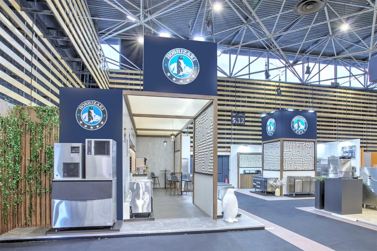
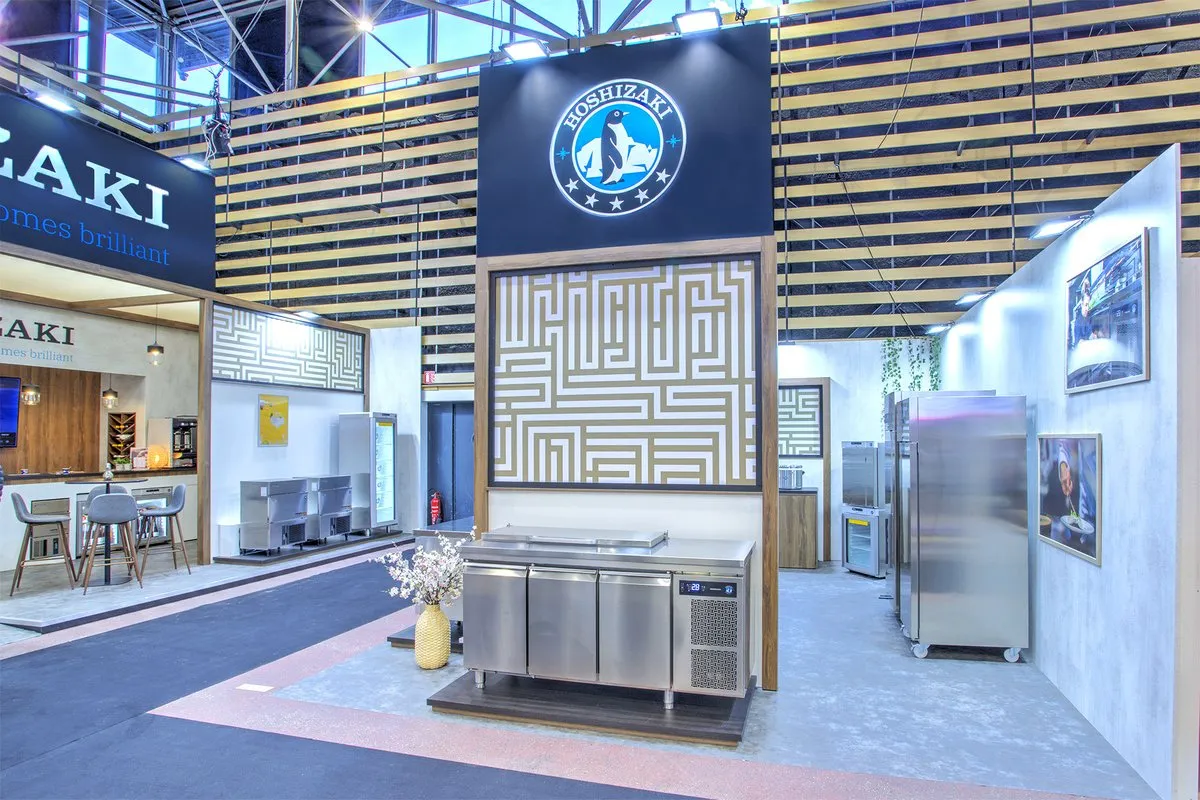
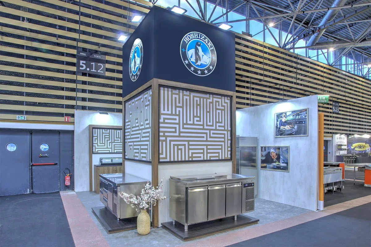
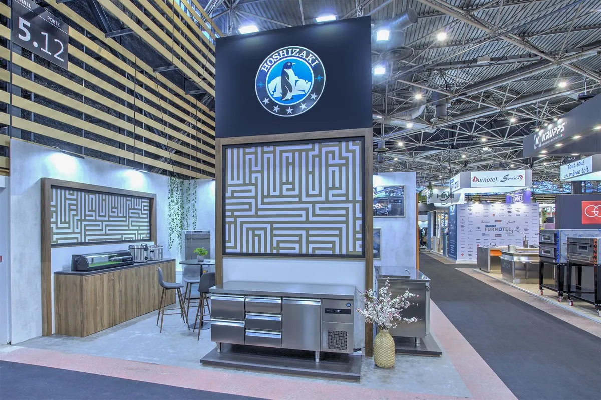
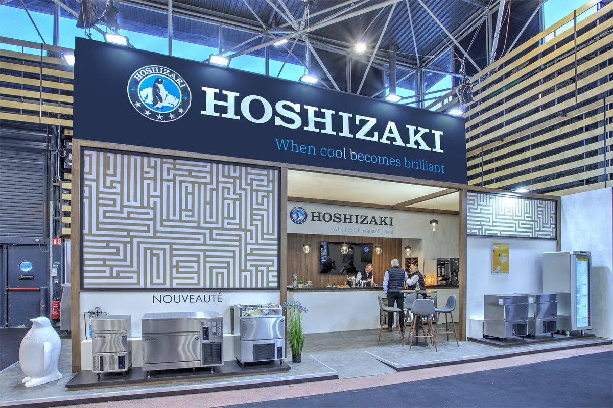
AUKARÉ structured the 96 sqm around a unique and instantly recognizable graphic language—a geometric labyrinthine pattern in gold and blue—applied across all the stand's signature panels. This ensures total visual consistency across all four facades while creating a powerful brand effect that is unique to Hoshizaki in this hall.
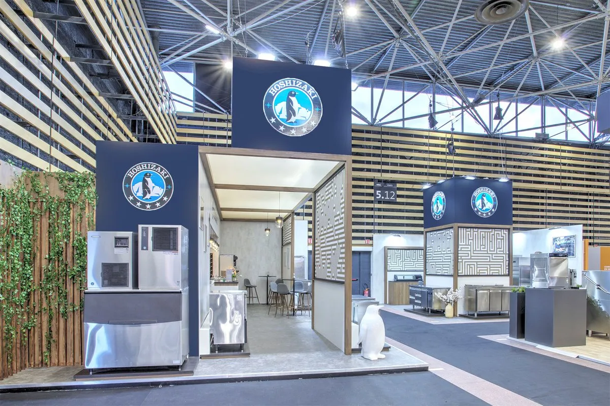
The space was designed as a showroom open to free-flowing circulation, organized into three complementary zones: a product demonstration area on the outer perimeter to attract passersby, a bar and hospitality space at the heart of the stand to extend conversations, and central presentation islands for key new products. The dual-logo central tower, visible from the four adjacent aisles, serves as a beacon in a hall crowded with over 3,000 exhibitors.
3
96
sqm
1
4
Architecture & materials
The architectural foundation relies on a carefully calibrated contrast of materials: light gray polished concrete for the floors and back walls (which highlights the brushed stainless steel of the machines without overwhelming them) and warm wood with gold frames for all structural and joinery elements. This dialogue between concrete, wood, and steel immediately establishes a high-end gastronomic kitchen atmosphere, consistent with Sirha's target clientele.
The central tower is the project's dominant architectural element. Built on a deep black pentagonal base, it rises to the height of the fascia and bears the Hoshizaki logo on two opposite sides, ensuring brand identification from a great distance along the two main aisles. Its base is clad in the signature labyrinthine pattern, which is repeated on all peripheral panels of the stand, creating a visual thread that unifies the 96 sqm into a single brand territory. The green wall integrated into one side facade provides a welcome organic break in a world dominated by metal and concrete, and creates a natural backdrop for product photography.
Signature graphic pattern
The geometric labyrinthine pattern (developed in gold to match the brand's premium codes) is the true common thread of the stand. Present in large format on the tower panels, in intermediate format on the partition walls, and in reduced format on smaller furniture elements, it creates a coherent visual system that makes the Hoshizaki stand instantly recognizable from any angle in the hall, even without reading the logo.
This bold graphic choice is also a statement: in a trade show where most equipment exhibitors rely on large-format product photos, Hoshizaki opts for an abstract and exclusive graphic identity—a signal from a brand that does not need to over-explain what it does.
Zones & features
The bar and hospitality area at the heart of the stand (dark wood counter, pendant filament lamps, designer high chairs) creates a miniature fine-dining restaurant atmosphere. This choice is intentional: it places Hoshizaki equipment in its natural context of use and allows sales teams to host chefs and buyers in a setting that speaks their language.
Products are displayed on raised podiums around the perimeter, each individually lit with understated presentation plaques. The white ceramic penguin statuette (the brand's iconic mascot) placed at the entrance acts as a nod to professionals who already know Hoshizaki, and an element of curiosity for those discovering it for the first time.
Colors & Identity
Three colors define the overall design: deep black for the high structures and banners to establish brand authority; warm gold for the graphic pattern and wood framing to introduce a touch of luxury and craftsmanship; and light gray concrete for neutral surfaces to highlight the brushed steel of the machines without visual competition.
This palette (cool, gold, neutral) is both consistent with the world of professional refrigeration and carries an elegance that stands out from neighboring booths, which often feature louder colors.
Visitor Experience & Journey
The journey was designed in three stages:
1. Long-distance attraction: The central black tower with its double-sided logo and large-format labyrinthine pattern are visible from the two main aisles of Hall 5. The Hoshizaki booth is identifiable from 30 meters away in an environment saturated with visuals. The height of the tower and the suspended "When cool becomes brilliant" banner ensure brand visibility well beyond the booth's footprint.
2. Invitation to enter: The booth is deliberately open on three sides, with no barricade counters or staff positioned to intercept visitors. Products placed on peripheral podiums invite people to approach, look, and touch, even before a salesperson makes contact. The penguin mascot at the entrance creates a lighthearted emotional hook in a highly technical environment.
3. Engagement and conversion: Once inside the space, the professional is naturally guided from the product discovery zone to the hospitality bar for a more in-depth conversation. The bar area, with its counter equipped with fully operational Hoshizaki machines, turns the demonstration into a direct sensory experience: the visitor doesn't just read technical specifications; they see the machine in action, hear its quiet operation, and handle it. It is the best possible sales demonstration.






@2026 AUKARÉ all rights reserved.