
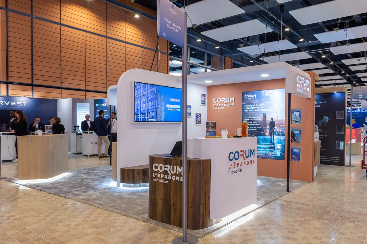
Corum L'Épargne 2x12sqm Stand - Patrimonia Trade Show
Corum L'Épargne caters to independent wealth management advisors—seasoned professionals who are regulars at financial trade shows, can size up a booth in three seconds, and judge a partner's credibility before even starting a conversation. At Patrimonia (the industry's premier annual event), the brand needed to simultaneously assert its status as a leader in SCPI fundraising, clearly communicate its two distinct offerings (Real Estate on one side, Life & Retirement on the other), and create a premium space for engagement that aligned with its high-end product positioning. Two brand worlds. One standard of excellence. 258 sq. ft. that commands attention at the leading wealth management trade show.
AUKARÉ
expertise
The challenge for AUKARÉ: fit two distinct brand identities into two adjacent 129 sq. ft. booths without one overshadowing the other, and without the result looking like two independent stands placed side-by-side. The goal was to design a dual presence that would be perceived as a single, powerful signature in an ultra-competitive hall.
The choice between custom-built and modular stands was clear: only a custom approach could create two distinct color palettes while maintaining a unifying architecture.


What the team has created
AUKARÉ solved the challenge using a shared architectural language of curves, which visually unifies the two booths from the aisles while allowing each to express its own color and editorial identity. Both back walls share the same height, the same system of rounded partitions with white framing, and the same thick carpet with underlay, though nuanced by two slightly different shades of light gray—creating a common foundation that is immediately recognizable as belonging to a single exhibitor.
The Real Estate booth is expressed in warm terracotta—the color of stone, real assets, and solidity. The Life & Retirement booth is expressed in deep corporate blue—the color of trust, financial rigor, and depth.
This warm-cool color dialogue (terracotta and blue) creates an effective visual contrast from the aisles while signaling that both entities belong to the same group, thanks to the consistency of the architecture and furniture.
2
24
sqm
3
1
Architecture & materials
The central design choice is the curve as a brand language. All furniture elements (reception counters, interior bench, signage totem) feature rounded edges, with not a single sharp corner. The brief was clear: create a sleek space with storage but without a traditional back room, while providing enough counter surface to accommodate catering services. This formal choice establishes a soft, accessible, and reassuring environment, in line with Corum's promise: savings that "simplify" financial complexity. In a hall dominated by right-angled booths and rectilinear structures, this curved consistency creates an immediately distinctive visual identity.
The main counter for each booth (in light natural wood laminate or dark walnut facade with integrated cool-white LED base lighting) is the centerpiece of the project. Its organic, semi-circular shape makes it a functional sales tool, a premium decor element, and a standalone brand asset, featuring the Corum L'Épargne logo in white letters on a wood background. The grazing floor light it emits creates a floating effect that immediately sets the booth apart in the trade show environment.
The low dark walnut bench integrated into the Real Estate space (backlit in ice blue) creates a transition area between the counter and the back wall, subtly inviting visitors to sit and extend the conversation without it being explicitly requested.
Screens & digital
Each booth has its own wall-mounted screen integrated into the architecture, playing key content on a loop. In the Real Estate booth, the screen is positioned in the upper corner, visible from the main aisle; in the Life & Retirement booth, it is centered on the blue partition, framed by product visuals.
Tablets placed on the counters (open to Corum product interfaces) complete the digital setup, allowing for real-time demonstrations during conversations.
Colors & Identity
Two distinct color palettes, one single architectural system. The terracotta of the Real Estate stand evokes stone, tangible assets, and the warmth of real-world heritage. The corporate blue of the Life & Retirement stand evokes depth, rigor, and financial trust. Light wood and walnut furniture serve as a neutral bridge between the two worlds, ensuring overall visual coherence. The white of the curved structures unifies both entities under a single architectural language. The cool white LED floor backlighting on each counter provides that premium touch—sober, elegant, and effective.
Visitor Experience & Journey
The journey was designed in three stages:
1. Dual attraction: The two stands, side by side, create a block of visual presence that occupies double the width in the aisle. The terracotta-blue contrast is legible from a distance, and the Corum logo repeated on three distinct counters ensures immediate brand recognition for professionals who already know Corum, and legitimate curiosity for those discovering it.
2. Natural orientation by color: The wealth management advisor who primarily handles real estate is naturally drawn to the terracotta stand. Those looking for a life insurance solution are guided toward the blue. This color-coded separation avoids any "menu-style" pitch at the entrance—visitors instinctively go where they need to be.
3. Conversation and conversion: Once at the counter, the background screen and the countertop tablet allow for an immediate dive into the heart of the matter. The interior bench in the Real Estate stand creates a zone for more in-depth conversation for discussions that deserve to be extended. The dark walnut exterior totem, positioned at the corner of the stand, acts as a signal from the aisle; a final hook for visitors who haven't yet slowed down.





@2026 AUKARÉ all rights reserved.