

APRIL Stand 3x18sqm - JDC Courtage Trade Show
APRIL targets a discerning audience of independent brokers who are well-versed in professional insurance trade shows. For JDC Courtage 2025, the brand needed to simultaneously assert its reputation, clearly communicate its 6 areas of expertise—Savings & Retirement, Loan Insurance, Personal Health & Protection, Professional & Small Business Health & Protection, Niche Property & Casualty, and International Health—and create the right conditions for seamless commercial interaction with its partners.
AUKARÉ
expertise
The challenge entrusted to AUKARÉ was to fit a comprehensive brand strategy into three complementary 18m² stands. These were not meant to be mere showcases, but genuine business tools. 54m² to embody 6 markets. Maximum presence.
Transforming a stand into a true qualified lead machine requires architecture designed for conversion: color-coded zoning, capture devices, and qualification scripts for the teams.



What the team has created
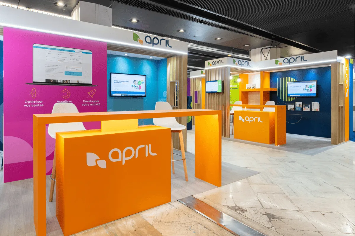
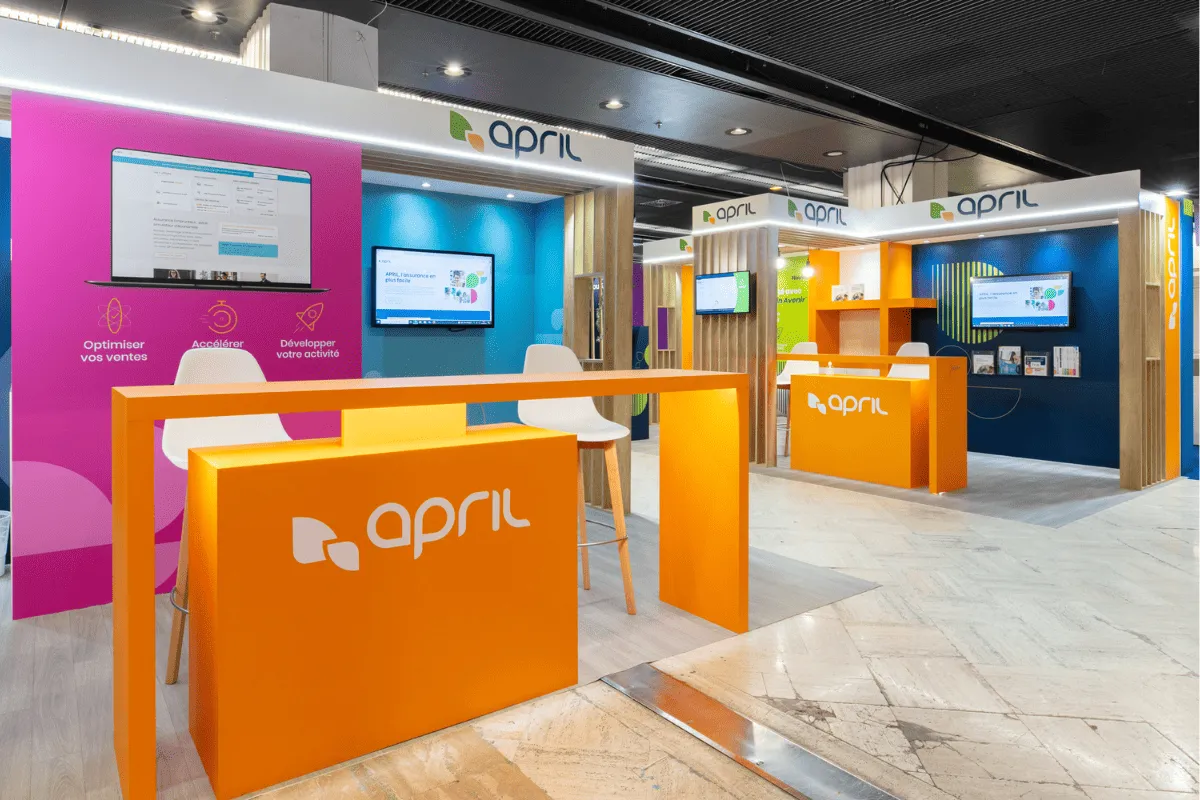
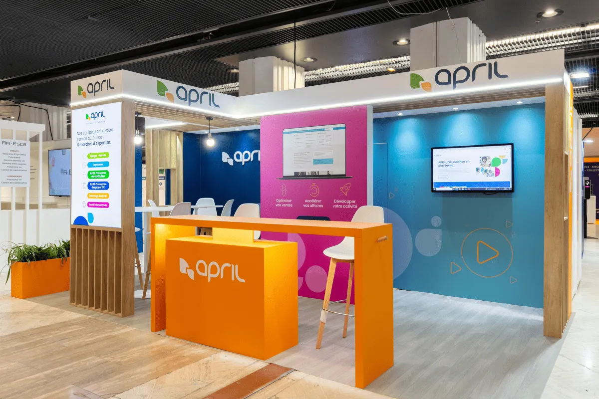
The AUKARÉ team structured the space around a logic of interaction zones activated by color, making each territory immediately identifiable without the need for closed partitions. A framework of vertical wooden slats frames the entire area, adding warmth and depth while keeping the stand open and accessible from every aisle. Color is not just decoration; it is the floor plan of the stand. Each backdrop (midnight blue, magenta, turquoise) instinctively guides visitors to the zone relevant to them, freeing up the APRIL teams to focus on sales conversations rather than navigation.
6
18
sqm
3
2
Architecture & materials
The foundation of the stand rests on a framework of regular vertical wooden slats, chosen for its dual role: visually structuring the space without enclosing it, and introducing a warm material that contrasts with the fully laminated stands surrounding it. This wood aesthetic creates a sense of breathing room in a dense hall, signaling an accessible and human-centric space that aligns with APRIL's positioning: "insurance made easier."
The orange from the APRIL brand identity is treated as an architectural material in its own right. The reception desk, high table, planters, and side panels are all finished in solid lacquered orange, turning each piece of furniture into an autonomous brand asset that is legible from a distance in the aisles and immediately associated with the APRIL identity in a highly competitive environment.
Colors & identity
Three backdrops in bold colors structure the zones without the need for partitions: midnight blue for the main product presentation, magenta for the digital demonstration, and turquoise for the meeting area. These chromatic shifts create unexpected visual depth for an 18m² space and allow multiple conversations to take place simultaneously without interference. This color-based discipline is the project's central design choice: in a constrained space, it is the only tool capable of creating perceived distance between zones without sacrificing the openness of the stand.
Technical features
Two screens are integrated into the structure at strategic points along the visitor path: one in the digital demonstration zone against a magenta background, displaying product interfaces and key sales points; the other in the meeting zone against a turquoise background, showcasing the brand on a loop. This dual setup allows APRIL teams to use the on-screen content as a first level of engagement, letting them focus on qualification and face-to-face conversion. The backlit entrance totem, featuring the 6 areas of expertise as colored pills, acts as an autonomous first point of contact, qualifying the visitor before they even begin a conversation with a sales representative.
Visitor experience & journey
The journey was designed in three stages:
1. Remote capture: The dominant orange and the elevated APRIL banner catch the eye from the cross-aisles. The stand is identifiable well before the visitor is in the direct aisle.
2. Invitation to enter The entrance totem featuring the 6 colorful markets and the open, barrier-free counter signal an accessible space, free from sales pressure. Brokers enter because they identify with at least one of the displayed markets.
3. Engagement and conversion Once inside the space, each zone offers a concrete activation tool: a demonstration of the APRIL digital interface, a presentation of sales optimization tools, and a standing meeting area to take things further. Visitors don't just discover APRIL. They start working with APRIL.






@2026 AUKARÉ all rights reserved.